| Unground | |
| A conversation between Bernice Donszelmann and Gina Medcalf |
|
BD: Going back to the question of colour. What brought you to appropriate your colour schemes from other painters – that is such a specific choice to make as a painter, and I think particularly when the work has a strong basis in process? GM: I wanted to get out of my own habits with colour. BD: Did you begin to do this before this particular group of paintings? |
|
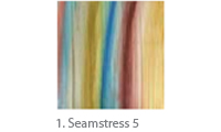
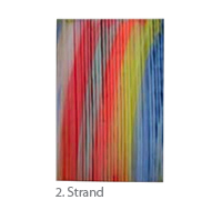
GM: No. It happened with this period of work. It started in a, not a conscious ‘this is what I’m going to do’ way, but I was looking at a Vuillard painting. I’d been at a show and was looking at his colour. I thought I’d put down some of his colours from an illustration in the catalogue and I mixed up enough to use in a painting. Those are the Seamstress paintings that preceded the one over there (Strand). And so the colours, because there had been much watering down by my brooming back and forth, didn’t look anything like the original. But that’s what connected me with them in the first place. The looking at the Vuillard, the realization that he put that next to that. I would never use that next to that. And that’s how … this palette was arrived at that I would never have thought of putting together. |
 |
Also in my painting there’s a right-to-left, left-to-right progression – which is not as it is in the original. In the original the colours surround one another, sit above or below. GM: I set out with an ordered process, a palette which is like the appropriated one, which then gets adapted by my process and needs. Chance enters in when I broom the poured paint. Up to then things have evolved in an ordered way. BD: Given how intensely interested you are in colour, there’s also something interesting in the idea that you would work with colour in a way that … GM: … The colours aren’t mine? BD: Yes, but also that most people who are very interested in colour are interested in the idea that colour has to be ‘arrived at’. And, in a sense, you are both not doing that and you are doing that. You are taking a preset system of colours and taking it through a particular procedure … GM: … but the preset system is only seven colours. Of course, there are more than that in any Vuillard painting. In a way the selection process has started straight away. I’ve chosen the colours I like. Or ones I see might work moving from left to right across the canvas. I couldn’t say what it is that makes a painting adaptable to take from it. There is certainly an emotional relationship that becomes internalized, evolving from the initial choice through to mixing up the colours from a reproduction. GM: Oh for me it would have been sinful! A boundary not to be crossed. BD: So even if the source that you are drawing from is not recognizable in the final painting, your use of it is important in terms of a shift in attitude. GM: In the paintings that preceded 2000 I appropriated a composition and that was liberating. Again it was not entirely recognizable. It was a very loose looking composition, very complicated. The more I worked with it, the more I realized that there was a fierce structure underlying it. That was a revelation …It was taken from this 18th century painting, actually it was a crop – you know one of those elaborate 18th century flower paintings. It was in the Spanish Still Life show at the National Gallery. There was something about the structure that I found compelling … And I drew it and drew it. And then I started to want to make it bigger so I squared it up. Then I realized that there was this amazing structure, that everything landed on a diagonal line or the junction of a vertical and horizontal. The paintings were from drawings of that structure, but they were also about … Do you know the Stieglitz sky photographs? BD: The cloud photographs? GM: Equivalents. There was something also taken from those. I think it was the photographic edge – how the photographic edge is very different from the edge constructed in paint, where one thing meets another. And I told you that I worked with photographs a lot, as a cataloguer in an auction house. With a loop, the magnifying glass, it’s amazing to look at how edges meet in photographs. I’ve always been interested in how the eye reads the photographic emulsion – which is after all barely there, but how you know that it is a layer of emulsion and it’s not a photomechanical print. The eye picks up these things somehow. It was these meetings and things in Steiglitz in particular that I was interested in. BD: And that impacted on these paintings? |
 |
GM: It did. They were all masked. And the edges were, some of them, quite blurred, some tight. So it was to do with edges, how one thing met another. BD: On the train up, we were talking about this question of painting and the heroic, your experience of working in New York in the 70’s and the heroic tradition. We were talking about it then in relation to your experience of thinking you were losing your vision and the impact that had on your working practice. Now we’re talking approaches to painting that happened prior to that … So perhaps this was something that was starting earlier. Was there some way of starting to adjust your thinking about how to make a painting that was less embedded in that heroic mode? What effected that shift? Conversation interrupted BD: There was a term you used on the train that I had liked, what was it again? GM: Endgame. BD: That’s it. GM: Yes, it was from the conference we both went to. I had liked that word as a description of the sort of experience of going into painting, of treating a painting like the last painting, it’s all in there, no half measures. Then, what it meant to acknowledge a half measure, or an interruption or externalization, was to acknowledge … BD: Failure? GM: Yes. Whereas I don’t think that is true that it’s a failure. Or true? I just think ‘endgame’ is part of a world, a cultural world, a man’s world … (laughs). BD: What do you think has changed for you? GM: Returning to England, for one thing. Being away from that sense of competitiveness that is New York. BD: The discussion we were having here around the idea of painting, the heroic and the ‘endgame’ and your own consciousness of your shift away from that attitude in the years after you returned from New York to England is in my mind connected in a way with the previous dialogue we had regarding your appropriation of sources. You are clearly not engaged in an appropriation that is a strict repetition and re-contextualization of something. The image I have is, rather, of someone who mines pictures – whether those are from the near or distant past is neither here nor there. In doing so, my impression is that you treat them as holding particular potentialities, i.e., that you appropriate a source because you detect a potential there – possibly an unrealized potential. Then as a painter your work is to transform and realize it differently. There is both a process of transformation and re-contextualization at play. The reason I relate this back to the issue of the heroic and the endgame is that it is, to my mind, absolutely not the attitude of someone for whom painting could ever be an endgame. Quite the opposite – painting could become quite infinite when viewed from this stance. Am I completely off the mark here? GM: I do and I don’t feel an attachment to the heroic/endgame. The wish for an endgame would be a wish to finish with painting/life. The obverse is to wish for continuous painting. I think that there is the feeling of continuous painting in the work in this show. |
 |
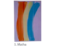
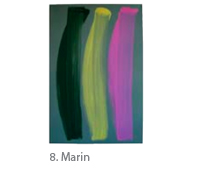
BD: I had wanted to ask you about these – the broom paintings (pointing to Unground 3 Reds) – on one level, they are what would could be called process paintings – in that their process is part of how they are read. But, in a way, they are not as obviously readable in their process as they initially seem. Unlike with, for example, a Bernard Frize painting, where the way that one reads the painting – you read the process of making – don’t you? When I saw these paintings first, that’s how I thought of them. But when I looked at them more carefully, I thought, well, no, that’s not really the case. GM: I do think that’s the case with these (pointing to Matha – a brush painting). BD: Yes, with these paintings you do see exactly how they are made. They are very self-evident. |
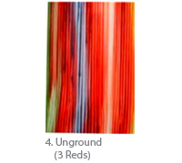 |
GM: With the broom paintings I think it is to do with illusion, the fact that this comes off the edge, that the edge is cut off by the rectangle rather than the painting remaining within. It’s all an illusion, a big illusion. (Sighs). It’s seems to me that many people who perhaps don’t read paintings regularly get stuck at the top layer and don’t read the layer underneath whereas I barely see the layer on top. I go straight to the back … for whatever reason. On the other hand, this is for me (pointing to Matha) a relationship to a more well known figure and ground sort of painting. Those (broom paintings) interest me more but I wish I could keep the sense … GM: Not good. BD: No? (laughter) GM: Not good. But I have to say that still they interest me more. BD: How do you feel ‘not good’? GM: I think it’s because the painting continues beyond what we now see. The beginning and end of the broom strokes have been cut off by the rectangle. I’d be interested in finding a way to have it all within the picture without it becoming about figure and ground. BD: In terms of what you’ve described of your process – I realize this is a rather impossible question – what would start to determine what would be a successful painting and not? |
 |
GM: Because I know that the colours are going to work, or if these linear … if it all becomes too straight, it’s flat and dull. The colour doesn’t hold the painting. It’s only when the colour and the drawing have equal interest or value that the painting comes alive. In these there’s a psychological space … you can almost walk through that space. It’s almost like a nice little corridor. Have you ever seen that Bresson film Pickpocket? It takes place on a crowded train and what interested me was the passing of these wallets down the corridor between this group of pickpockets. It’s this kind of narrow space … BD: So it holds itself in a kind of tension. It would be interesting to see a failure. GM: I have lots of those. BD: You have said that these paintings are very unusual for you in terms of their scale. Previously you have worked very large. My feeling is that if this work were to be very large it would become somewhat spectacle-like. GM: I agree absolutely. BD: What initially motivated that move from a very large scale to this more modest scale? GM: Initially, with the first broom paintings, the scale was limited by my reach. But there are many reasons: it has been a slow and organic change. A number of things were happening. I said that there was a period where the drawing was a significant aspect. Around that time, a lot of people, including me, were thinking of a painting like that (gestures across to indicate a lateral field). I wanted to recreate that (gestures indicating a depth field) but not too deep. And I had trouble doing it. And the drawing in these paintings is definitely not about the eye moving across. |
 |
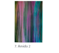
BD: No, that movement is there but there definitely is a movement into the painting. (BD in front of Amido 2). It’s interesting in reference to your earlier comments about how some people when viewing the paintings get stuck at the second, the ‘surface’ stroke, while you say your own eye moves immediately to the initial layer behind. Looking at this painting now, it strikes me that it’s in the hesitation between those two layers, that the painting seems to exist visually. I think that one ‘opts’ for back or front in order to stabilize it. BD: What I’m describing here is an experience of seeing where I’m becoming very conscious of my own process of seeing and what is involved in it. So while there may be an illusion of a shallow depth at play here, it is one that operates in tandem with a certain self-awareness on my part as a viewer. It struck me when you were talking about the Spanish still-life series that you shifted quite abruptly from your description of your interest in the composition of the original painting to the question of edges. You began to describe how one sees edges differently in a photograph and in a painting and howthe difference in that aspect of the process of seeing also became the basis for those paintings. So it seems to me that a consciousness of the reflexive process of how one sees forms a strong basis for at least some of your work, certainly these two series. I’m curious to know how deliberate or systematic this might be for you as an artist? GM: The interest in the painting/photo edge that I mentioned had been there for a long time. So there are these interests like how edges are formed that find something to attach themselves to in order to take the internal narrative forward. So yes there is something deliberate and systematic that follows on from that. It’s like being involved in a plot. You do what you have to do to take the mystery forward. GM: There are ways of coming at the painting that would be more oblique. I’d like to make drawings that are only obliquely connected with the way I make paintings. |
 |
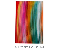
BD: This group of paintings (the brush paintings), was that a way of trying to think about how to address that idea? GM: Yes, it probably was. BD: I think of these two series as being quite fundamentally … even though the process of the making has so much in common, there is something very fundamentally different in terms of their attitude. GM: Yes, I agree. By far the largest response has been to the brush paintings. BD: Really? In terms of where your real engagement lies, it is clearly with the broom paintings. The intensity of this series, it feels to me, lies with your fascination with light. GM: I’ve never consciously said to myself that I wanted to make paintings about light. My response to the landscape has not been the Romantic one; being in the landscape is more likely to give me a feeling of fear than transcendence. I was born by the sea and have a neurotic fear of all that. BD: So you connect a fascination with light immediately to landscape? I think that I would connect the issue of light in your work more specifically to the relationship between light and colour rather than that between light and space. GM: It’s true. There is a window in our bedroom that I am looking at constantly whilst I am doing other things but where the colour changes all the time, day and night. I have always felt that this has been a catalyst of some sort for me. BD: One thing that I find very compelling about the broom paintings is the way that colour, even when it’s actually chromatically very intense, appears muddy by way of its relationship to the light areas. I don’t mean this in a negative sense. There’s something about its materiality that makes the colour feel somehow heavy. It has an odd material nature and it’s because it is the obverse of light. GM: It is muddied, actually. BD: Even though it is intense? GM: The intensity is in the original stroke. The second stroke always ‘muddies’. It intermixes the colours, it intermingles the colours. But I never plan that colour. It is a ‘happened’ colour. There are two things – one the muddiness, and the other the weight, the heaviness of the painting’s materiality. But perhaps you see them as connected? It’s difficult to know exactly what you are seeing but I feel as if you are having an important perception here. I wonder if the ‘heaviness’ you speak of refers to the difference between transparency and opacity? BD: Well, if I’m looking at the very intense passages of colour in both Strand and Dream House, I experience them as both chromatically very luminous and paradoxically ‘dirty’ or shadowy at the same time. This is, I think, the reason why I am connecting a kind of muddiness and materiality together. Yes, I think that transparency and opacity is the key difference that brings about this impact. But I think that it is the way that light in the sense of ‘illumination’ becomes inseparable from lightness in the sense of weightlessness and then, conversely, the way that darkness then finds itself aligned with weight that is really at issue. That’s what I mean by the surprise of a chromatically intense colour taking on an odd materiality – because it’s the obverse of light in both senses. And then there is the complication of the way that plays with the paint’s ‘body’ too. GM: Mediums are added to the acrylic paint to give it the right viscosity to be swept across the surface. They also give the paint body, which prevents the colours from intermingling too much. You use the word ‘muddying’ which implies a loss of transparency. In the intermingling of colour which happens with the second stroke there is an intermixing of transparent and opaque colour and, therefore, a loss of the luminosity of the transparent colours of the first layer. I think this is what you must be experiencing; the expectation of intense colour set up by the first layer is muddied by the second. BD: So much of our discussion hinges on the intricacies of painting and seeing. And that makes perfect sense because of the nature of the work. Given the dramatic turn of events in the past ten years for you personally – from having been told in no uncertain terms that you were losing your eyesight to a turn around by way of developments in drug treatment – the temptation to read the work through the filter of biography will naturally be strong. I’m aware that you are wary of this, and understandably so. But at the same time, it would be good to hear you discuss your take on the question of the place of autobiography generally. To my mind there is always an important distinction to be made between looking at how dimensions of an individual’s autobiography might provide a kind of drive behind a practice, in other words, energize it in particular ways and give it focus vs. more literal readings of how it might inform the ‘content’ of a work. GM: I think there is a contact with art when you look at it which is unworded, primary, so unaffected by autobiography. However, at the time of my eye diagnosis, I noticed that without optimism about the future of my painting it was hard to find the energy and drive necessary to continue with work. The daily practice of painting was important to renewing that drive. But where vitality comes from is a complex thing. From contact I guess. As E.M. Forster says 'Only connect'. |
 |
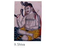
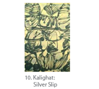
GM: Well there’s a lot. Let’s just take a group of things. One, as I said on the train, was after an extended visit to India, looking at sculpture predominantly, temple sculpture. It’s something about the continuousness of that that I was interested in. There were changes of scale and … it was just very fluid, more fluid than anything I had seen in Western art. I had looked at Indian art in museums but in situ it felt very different. So there, in India … the way it related to the architecture, the way it was the architecture, the way it was carved out of a single thing, it was just incredibly fluid and … terrific. I came back and for the next couple of years made a series of paintings and was showing with Kapil Jariwala who was born in Gujarat and he had a collection of Indian paintings and I was also looking at those. Kalighat paintings are made quickly. They were made for tourists, sold outside of the temples in Calcutta, on paper, in watercolor, high colour. One stroke covered a whole dress. Amazingly, again, fluid. Now, you could say gestural, but they weren’t gestures, they were distinctly, like how a cartoon is fluid because it has to tell you something very quickly. There’s that sort of fluidity. BD: Abbreviated almost? GM: Yes. In that area. And I wondered when I made these paintings, which I thought of as a single stroke, whether … as a viewer you’d get it all in one go, the whole, very quickly, you put it together, it’s not complicated. All these sorts of things came out of that trip to India. There was an earlier series in New York where I would hang the paint on a drawn line: two operations, first the drawing, laterally, horizontally along the surface of the painting and then the paint application afterwards, which responded to the line, depended on it, ‘hung’ on it. Most of these paintings were very long and narrow – fifteen feet – and would get done in, I call them ‘campaigns’. Old master drawings were often done in campaigns. If they were complicated compositions and not done in one sitting, you can tell where a day’s work ended and that is called a ‘campaign’. So there were a few campaigns in a painting of mine called Halifax because it is so long. And you could sort of see that as well. … Colour has always been important but never as much as now, I think. Largely the drawing knocked the colour out because it was so predominant. BD: In what you’ve described of these paintings after India, there’s a sense of developing a strategy for how to approach making a painting. That does have a connection with the current work. GM: Yes, it does. BD: There is pre-planned logic. GM: There is a purpose … that gets you through fifteen feet … imaginatively speaking and energy speaking. But what the purpose precisely is, that is complex and multiple. BD: I’m often struck by your use of certain terms like ‘campaign’ or the way that you describe the second brushstroke in the current painting as a ‘correction’. These terms seem to be important to your working process as both descriptions and something more. GM: Yes, to find a key word that fixes something visual is satisfying. BD: The notion of quite a simple gesture that carries the load of much more than it is in itself also seems to be quite fundamental in both of these series. GM: In the Indian paintings that is what attracted me to them. That they were made by artists who wanted to convey something - often they were depictions of gods, or topical tales of love and death – simply and quickly. |
|
 |
|
List of illustrations 1. Seamstress 5
|
|
Photo credits: John Riddy 2, 4, 6, 7, 8, 9 Grant Taylor, New York 10 3 The artist 5 Peter White, FXP Photography 1, 3 |
|
© Gina Medcalf and Bernice Donszelmann |
|